


Contextual Personas for Edge Devices
by Admin-checker
INDEX
Learn how to design dark mode interfaces that support low-vision users. Get accessibility tips for contrast, readability, and visual comfort.
Date Jul 25, 2025
INDEX
Dark mode serves as an essential tool which benefits users who have low vision.
But not all dark modes are created equal.
The improper implementation of dark mode results in negative effects that include eye strain and confusion and complete content unreadability.
Designers need to implement accessibility features in dark mode beyond simple color inversion to achieve success. Designers need to balance contrast with legibility and user control to create truly inclusive experiences.
The dark mode feature provides several benefits to low-vision users by minimizing glare and improving visual clarity.
The feature provides maximum benefits when used in low-light settings or by people who experience light sensitivity.
Properly implemented, it offers:
The improper implementation of dark mode actually worsens accessibility problems.
Poor dark mode implementations often fail due to:
The first step to avoid these pitfalls is to understand how low-vision users perceive visual information differently.
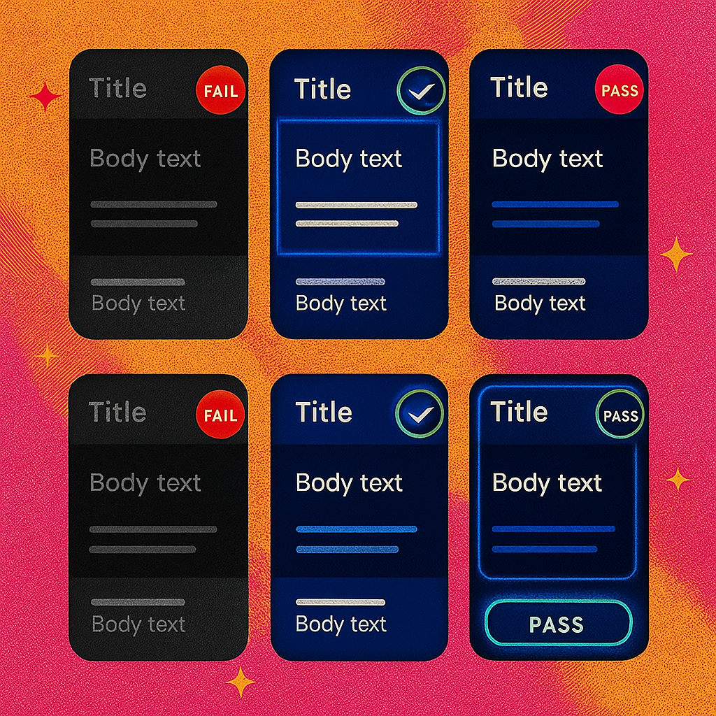
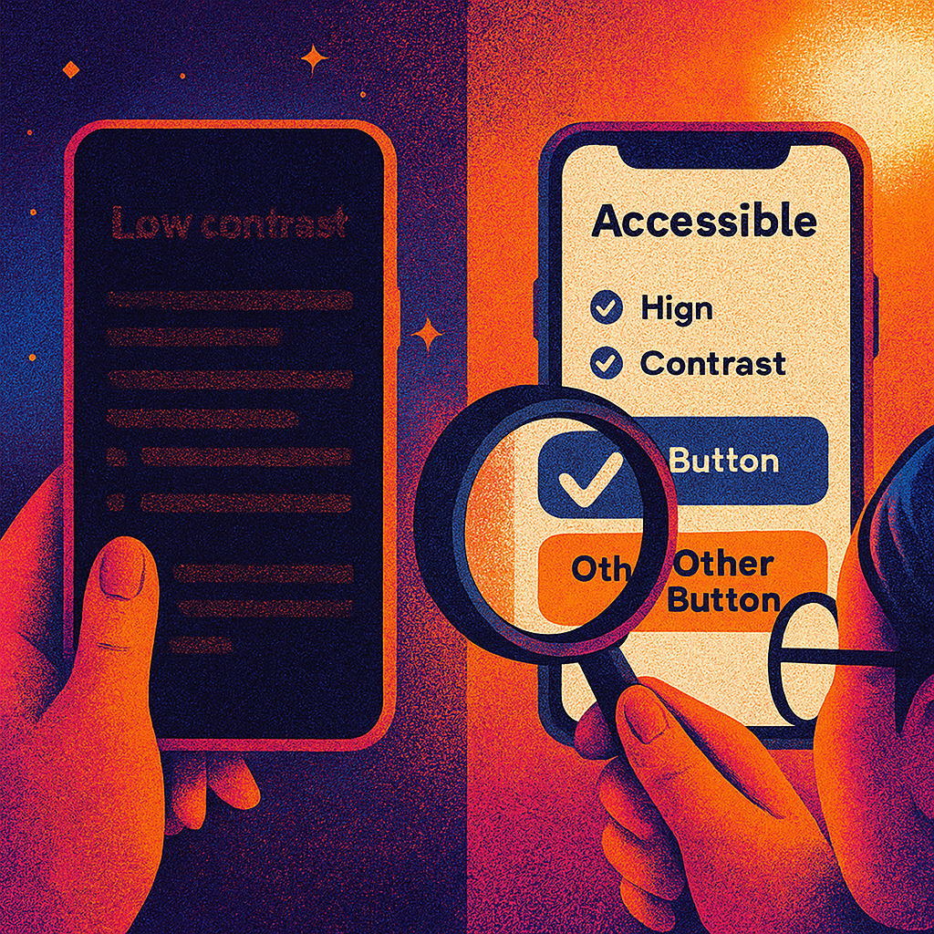
✅ Use proper contrast ratios
True black (#000000) can cause high glare and “halo” effects. Opt for dark grays like #121212 or #1C1C1E to ease transitions between elements.
✅ Avoid pure black
True black (#000000) can cause high glare and “halo” effects. The transition between elements becomes smoother when you select dark grays such as #121212 or #1C1C1E instead of true black.
✅ Test color combinations with vision simulators
Simulate conditions like cataracts or tunnel vision to test visibility under different impairments.
✅ Allow theme switching
Give users the option to toggle light/dark modes—and remember their preference.
✅ Support zoom and scaling
Ensure your dark mode layout scales properly for users who increase font sizes or use screen magnifiers.
The design team at Boosta integrates accessibility as a fundamental element in all their design choices.
When we build dark mode UI, we:
Our dark mode designs combine style with functionality to benefit all users.
Dark mode functions as an effective tool for low-vision users when developers create it with careful consideration.
The creation of accessible dark UIs requires designers to focus on contrast and user control and legibility.
Designing for accessibility means designing for all users. The only UX that will matter in 2025 is the one that is accessible to everyone.
Teams use Zapier in boardrooms, spare rooms, and rooms where AI has ROI.