Neurodiversity‑Ready UI Patterns (Beyond Contrast Ratios)
Learn how to design neurodiversity-ready UI patterns that go beyond color contrast. Study accessibility, inclusive design, semantic HTML, and accessibility testing tools.

Neurodiversity-Ready UI Patterns (Beyond Contrast Ratios)
When discussing accessibility, the attention tends to turn to visual changes, like a color contrast checker, to comply with WCAG guidelines. The access for neurodiverse users is very important. The access for neurodiverse users does not get attention.
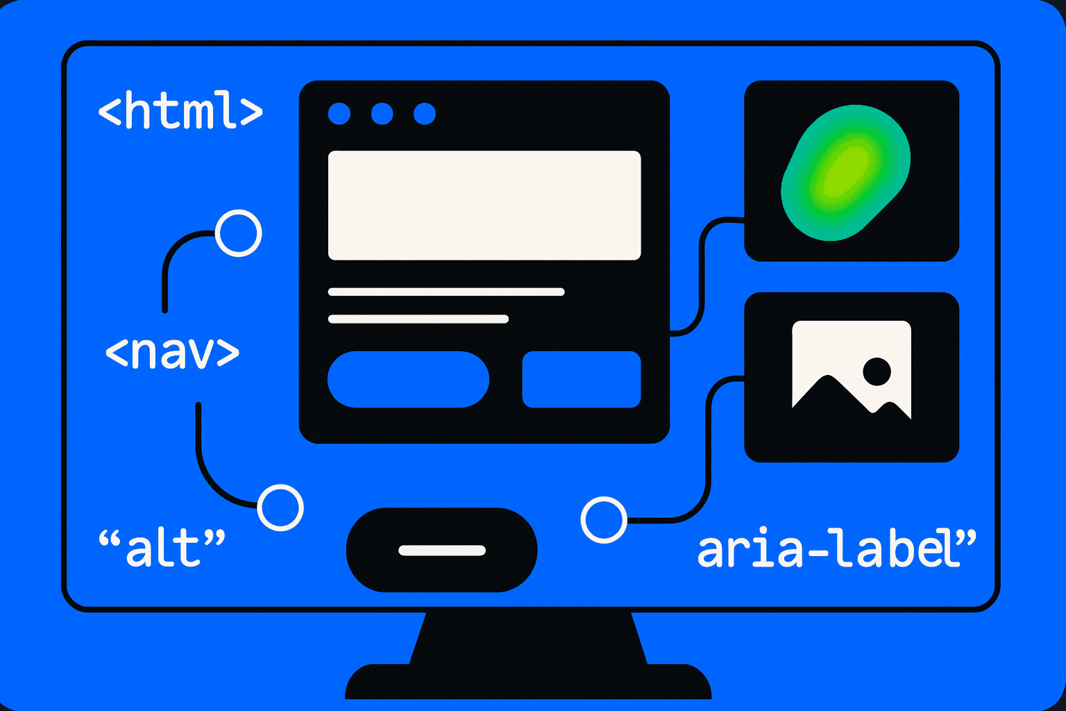
The people with ADHD, dyslexia, or autism need access. A web design that is accessible not only involves the ratios within pages, but also uses the semantic HTML, aria labels, and inclusive design in the design of patterns with meaning for cognitive accessibility.
Why Contrast Alone Is Not Enough
To ensure readability, the use of a color contrast checker is essential for confirming compliance with ADA compliance standards and WCAG guidelines; however, neurodiverse users encounter hurdles of their own beyond this:
Navigation is overwhelming if it's too intricate.
Flashing or looping animations can distract.
Ambiguous icons without alt text for images lead to confusion.
A more holistic approach is needed for accessibility to allow for more general usability to include systematic usability testing and comprehensive accessibility audit processes for these users.
Neurodiversity-Ready UI Patterns
To go beyond color, designers should implement patterns that improve web accessibility at multiple layers:
Semantic HTML — Proper heading hierarchy, lists, and regions improve comprehension.
ARIA Labels — Enriching interactive elements ensures screen readers and assistive tools provide clarity.
Accessible Web Design Layouts — Consistent spacing, reduced clutter, and predictable positioning help cognitive flow.
Alt Text for Images — Visual elements require descriptive support for users who rely on context.
Inclusive Design Language — Clear instructions, plain language, and feedback cues reduce misinterpretation.
Testing for Neurodiversity Accessibility
Moving beyond visuals requires continuous validation:
Run accessibility testing tools like Axe, Pa11y, or Lighthouse.
Conduct an accessibility audit. The full accessibility audit must include neurodiverse user feedback. I will gather user feedback for the accessibility audit.
Simulate different reading modes using browser extensions.
Test against multiple WCAG guidelines levels, not just AA compliance.
Make sure the design patterns are inclusive. I make sure the design patterns meet the ADA compliance requirements and stay user-friendly for all audiences.
The Future of Inclusive Design
Neurodiversity-ready UI patterns are a step in the design. Of the looks, Neurodiversity-ready UI patterns focus on the clear layout, the predictable behavior, and the mental ease. I use Neurodiversity- UI patterns with HTML, aria labels, and alt text for images. I also use tools that test accessibility early. This approach gives the web design that celebrates each type of diversity.
Conclusion
We design for neurodiversity. See that accessibility is more than the checklist. Accessibility is not just the list of items to check. Although color contrast checker tools and WCAG guidelines are fundamental, the real inclusion comes from inclusive design, semantic structure, and iterative testing.
An adequately executed accessibility audit ensures compliance with ADA legislation but also designs interfaces that enable all users to be successful. By going beyond ratios, we create digital spaces that empower, rather than push people out.