What Makes a Component Accessible? A UI Library Audit Checklist
earn how to audit UI components for accessibility using WCAG guidelines, semantic HTML, ARIA labels, and proven accessibility audit practices.

What Makes a Component Accessible? A UI Library Audit Checklist
Many design systems claim support for web accessibility. The design systems have UI components that often fail real accessibility audits. The buttons, the modals, the inputs, and the navigation elements look compliant. The buttons, the modals, the inputs, and the navigation elements break when the WCAG guidelines are applied or when the assistive technologies are used.
The article explains what makes a component truly accessible. The article also gives an accessibility audit checklist for reviewing UI libraries.
Why Accessibility Must Be Evaluated at the Component Level
Accessibility issues rarely come from entire pages. They come from reusable components that scale across products.
When components lack accessibility:
screen readers fail to announce state changes
keyboard navigation breaks critical flows
ada compliance risks increase
accessibility testing tools report recurring errors
Auditing UI libraries prevents the same issues from repeating across multiple interfaces.
Component Accessibility vs Page Accessibility
Page-level fixes do not solve structural issues. Accessible web design starts with accessible building blocks.
Core Accessibility Requirements for UI Components
Every reusable component should meet baseline accessibility standards before entering production.
Key foundations include:
semantic HTML for correct structure
sufficient color contrast verified with a color contrast checker
keyboard operability without workarounds
meaningful aria labels only when necessary
Components should communicate purpose, state, and feedback clearly to all users.
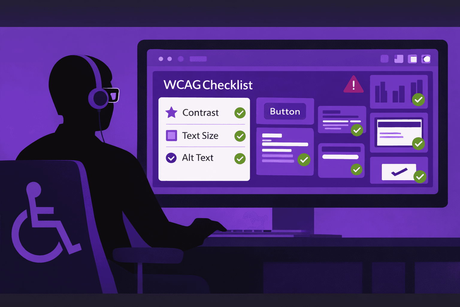
UI Library Accessibility Audit Checklist
The checklist below can be used during an accessibility audit or design system review.
Component Check | What to Verify | Tools or Methods |
|---|---|---|
Semantic HTML | Correct native elements used | Code review |
Keyboard access | Full functionality via keyboard | Manual testing |
Focus states | Visible and logical focus order | Browser testing |
Color contrast | Text and UI contrast meets WCAG | Color contrast checker |
ARIA labels | Used only when semantic HTML is insufficient | Accessibility testing tools |
Screen reader output | Clear announcements and roles | Screen reader testing |
Error handling | Errors are announced and understandable | Manual + automated audit |
Alt text for images | Functional images have meaningful alt text | Accessibility audit |
Common UI Component Accessibility Failures
Many accessibility issues repeat across products due to shared components.
Typical failures include:
div-based buttons without keyboard support
incorrect ARIA roles overriding semantic HTML
missing labels on form inputs
decorative icons exposed to screen readers
These issues often go unnoticed until late-stage accessibility testing.
ARIA Labels as a Last Resort
ARIA labels should enhance accessibility, not replace proper markup. Overuse can introduce more problems than it solves.
Integrating Accessibility Into UI Library Governance
Accessibility should be a gating criterion for component approval.
Best practices include:
accessibility audit before component release
documentation of accessibility behavior
periodic reviews using accessibility testing tools
shared ownership between design and engineering
This approach supports inclusive design while reducing long-term remediation effort.
Conclusion
The appearance does not define a component. The behavior, the structure, and the feedback define a component. We have seen that the UI libraries that use HTML, that respect WCAG guidelines, and that pass accessibility audits create products that are more resilient and more inclusive. Treating accessibility as a component-level responsibility leads to web design.